Colour House Project
If ever there was a project reveal to make you smile then this one has to be a real contender. In fact the last time I visited my client said, “it just makes me happy to be in it”, which is exactly what you want to hear at the end of a long project which has had its moments (haven’t they all).
I actually started working on the project at the start of 2019 which feels like an actual lifetime ago, a simpler time if you will.
My clients had bought a new house in Chorlton, South Manchester and were doing a complete renovation including an extension to the rear to create a large open plan kitchen, living and dining space, and an attic conversion for a main bedroom suite as a retreat from life with 3 young children.
I was hired initially to work on the open plan space. The brief was, and has always been, colour, and lots of it. A lovely brief which means your imagination can run wild and you can suggest those ideas that you’ve been saving up for the right people to come along.
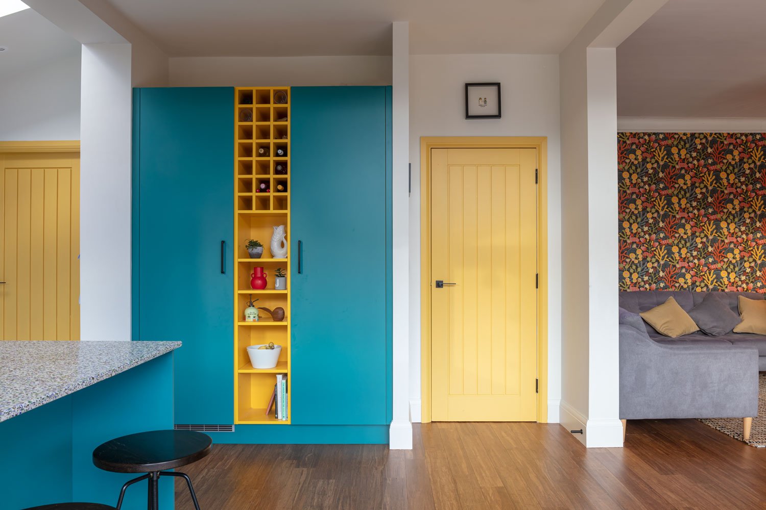
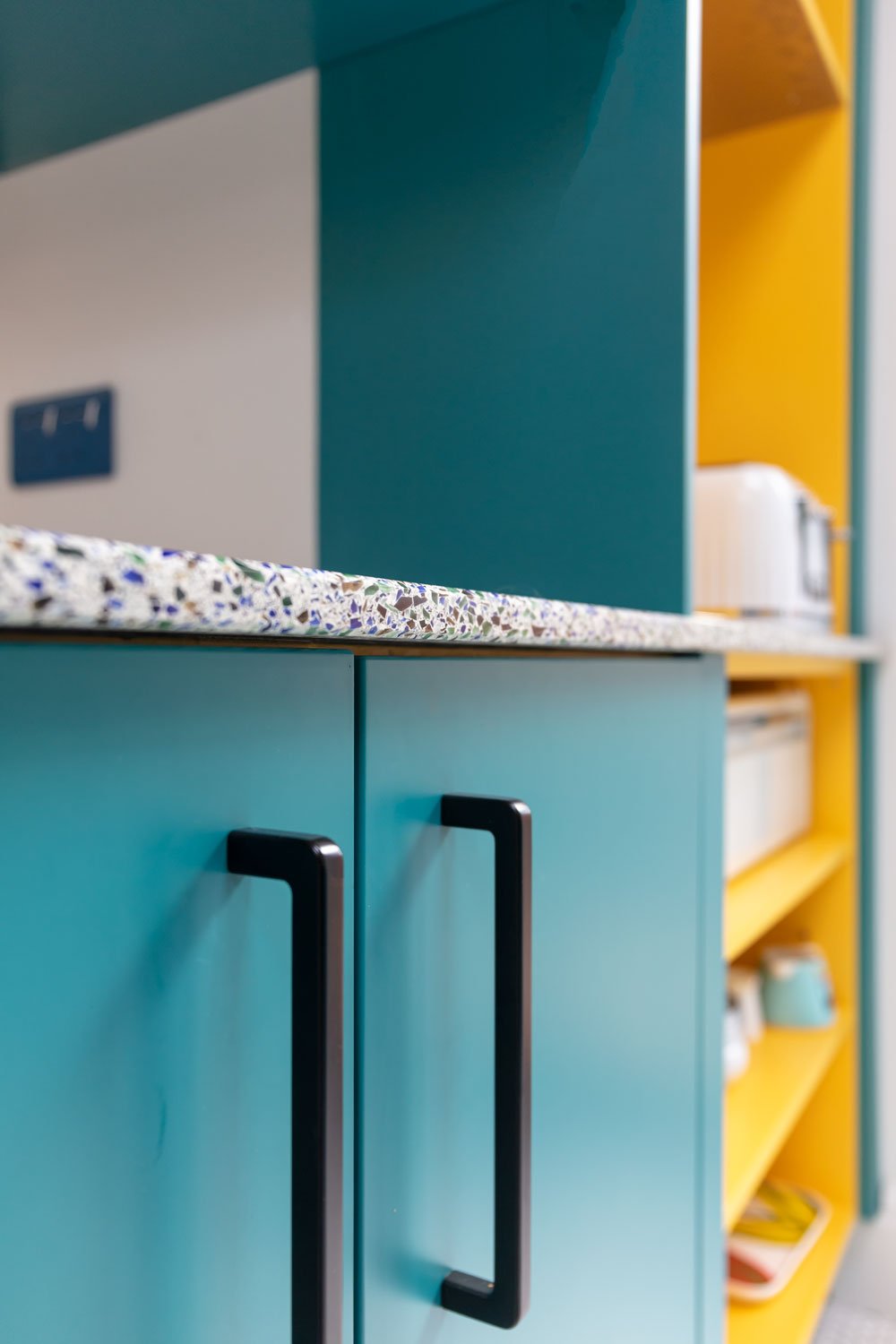
We always knew teal was going to be a big part of the equation so we started with a teal kitchen, expertly brought to life by Kitchens by Kemp. The colour is a match to Farrow & Ball Vardo and is brilliantly accented by pops of yellow throughout including all of the carcasses which is a lovely burst of sunshine every time you open a cupboard.
My favourite part of the kitchen however is the recycled glass worktop. I’ve used this material in a previous project in a more muted colourway and loved using it again here with pops of blue and green creating a really striking (and forgiving!) surface for the large peninsula.
We also zoned the kitchen space with a white mosaic floor which contrasts with the darker bamboo flooring used everywhere else on the ground floor of the house.
Inspired by some of the clients’ artwork the idea for the splashback was loosely based on a Mondrian-style aesthetic. I loved the idea of using quite simple, relatively inexpensive tiling to create something really striking and completely unique with a big splash of colour that hits you as soon as you walk into the room.
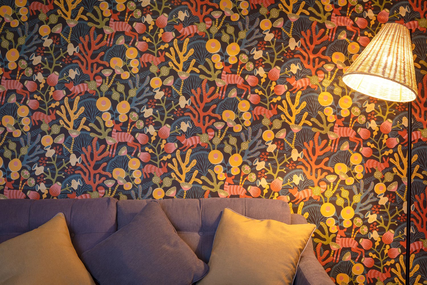
The colour pops continue elsewhere around the room and contrast with some simpler, natural materials such as wood and rattan. The Borastapeter Korallang wallpaper brings a colour riot in the living room while doors in Farrow & Ball Babouche are another joyful touch.
The Mondrian theme also continues into the downstairs WC contrasted with more teal in the Colour Flooring vinyl floor and the starker white of the Lusso Stone basin and matching white tap.
After completing the design for the ground floor space I was also then hired to help with the main bedroom and en suite and also the family bathroom which would be a space mostly for 3 young girls.
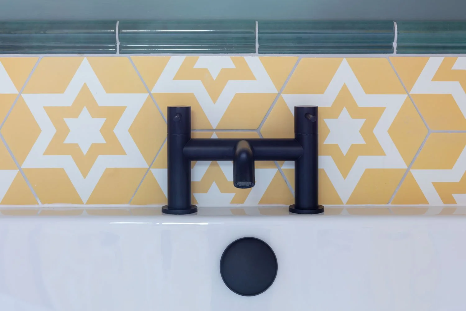
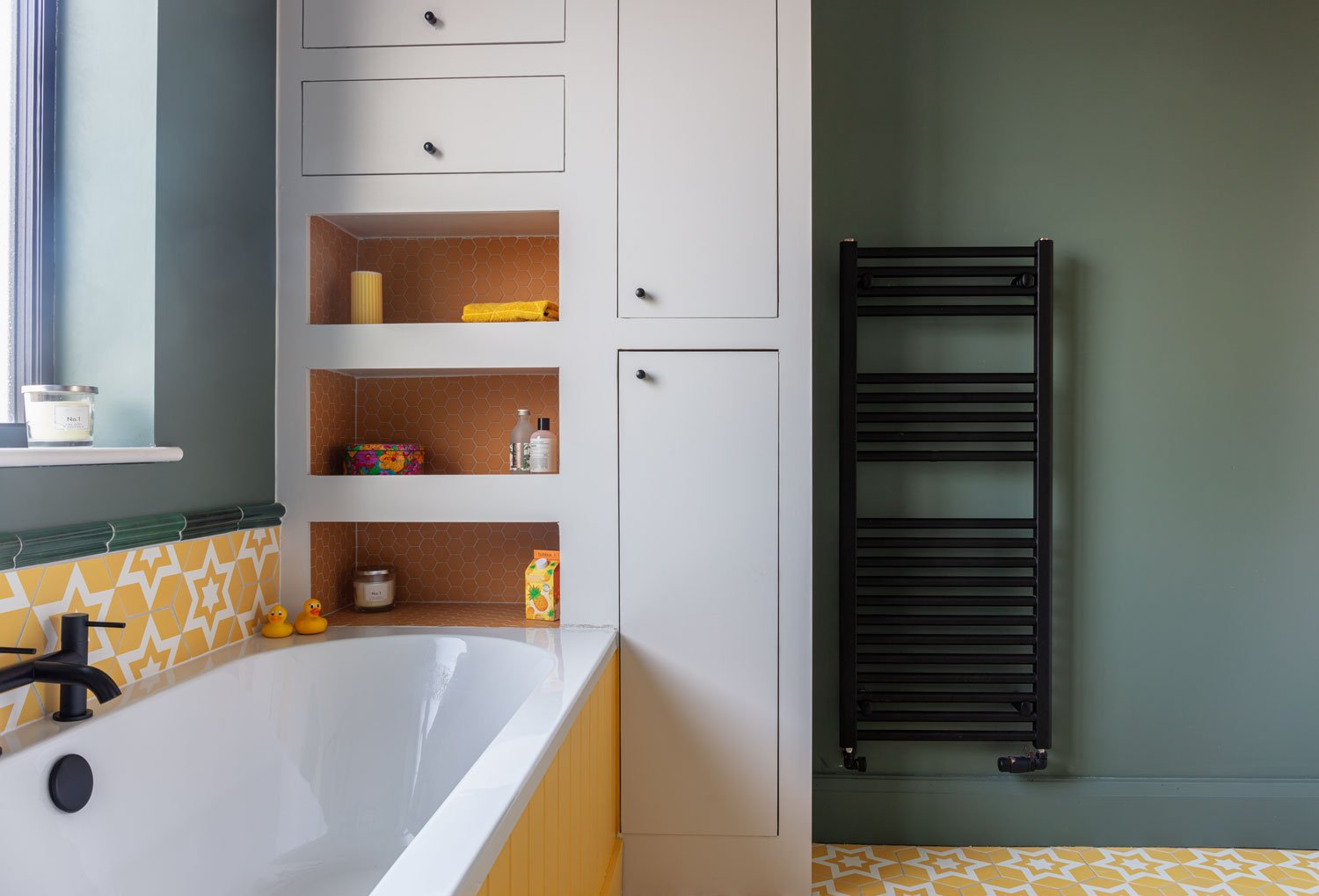
With this in mind I designed a room that hit the colour brief with an even more playful feel with the stand out feature being the Nova Porcelain Custard hexagonal floor tiles from Ca Pietra which also continue up behind the vanity cabinet and bath.
With 3 girls we also knew storage would be an ongoing issue and so I also designed a bespoke piece of storage to sit next to the bath which gives some open and closed storage for towels, linen and toiletries.
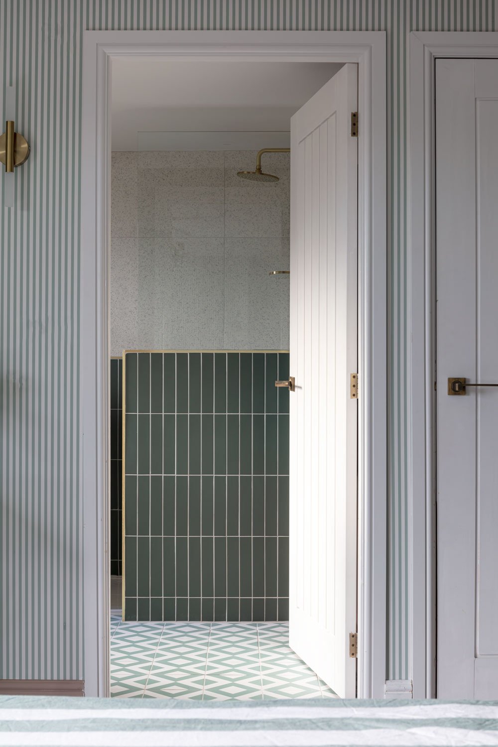
In the main bedroom suite on the top floor the colour continues albeit in slightly more muted tones and with a more grown up, luxurious feel. In particular the green shower area, with its brass finishes feels like a real escape from family life and is lovely to glimpse from the bedroom in the morning.
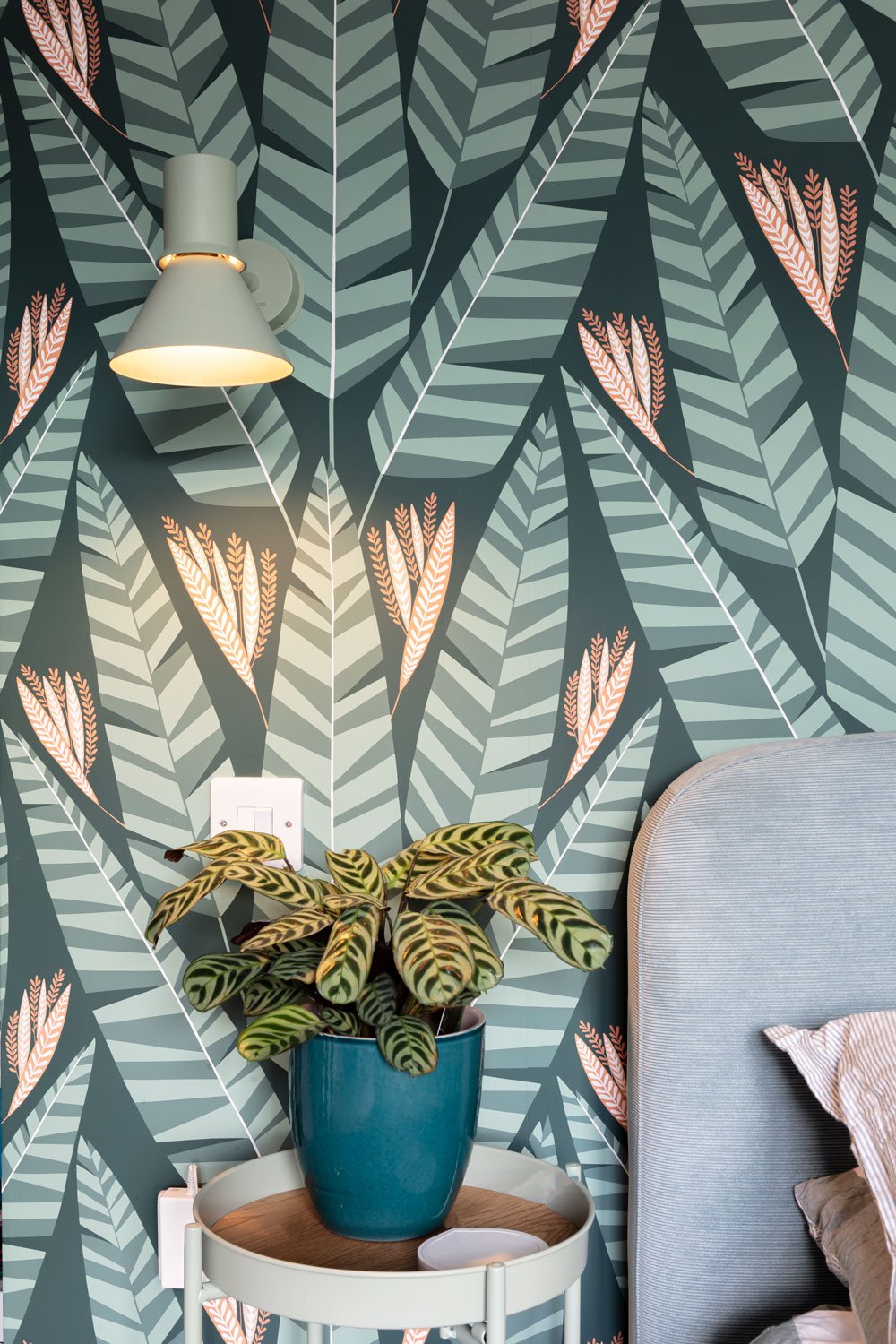
The greens used in this space are a nod to the colours chosen elsewhere in the house but create a different, restful and mature atmosphere combined with the more muted Farrow & Ball Dead Salmon in the bathroom and on the woodwork and Sandberg striped wallpaper in the bedroom.
After a gruelling build it’s a joy to see the family in the space, filling it with their things and making use of every little corner of colour.
All images ©Lived In 365


